Key Design Elements to Make Your Yoghurt Brand Stand Out
Minimalistic Label Design
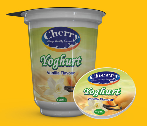
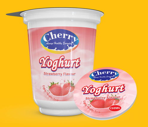
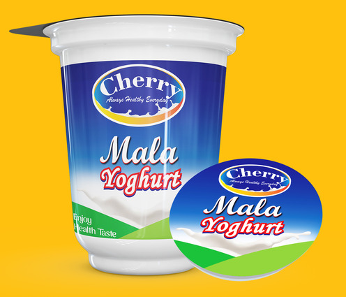
For an attractive Yogurt Label Design Kenya ,Tanzania , Dar es Salam, simplicity is key. Using clean colours, simple patterns, and uncluttered layouts makes the product more appealing and enjoyable to purchase. A minimal design creates clarity and improves customer trust.
High-Quality Packaging Material
Using strong, high-quality packaging helps preserve yoghurt freshness, taste, and shelf life. Good packaging prevents air from entering the product and protects it from harsh environmental conditions that could affect quality.
Creative Corporate Identity Design
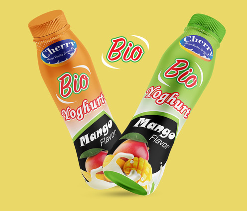
Your logo should clearly represent your yoghurt brand. A yoghurt label is more than just packaging—it is a visual identity. A well-designed logo and illustrations help create a strong first impression and make your brand easy to recognize at first glance.
Creative Element Arrangement
Avoid overcrowding your yoghurt label with too many visuals. Ensure the brand logo remains visible on both white and solid backgrounds. If using milk splashes or illustrations, make sure they do not interfere with important elements like the logo or nutrition information. A balanced layout gives the eye space to rest and understand the product details.
Colour Scheme and Theme
Colour plays an important role in food packaging. Choosing colours related to yoghurt and dairy gives your product an advantage. For example, green often represents freshness, health, and natural ingredients. Select colours that reflect your brand values and appeal to your target market.
Typography and Font Choice
Typography communicates your brand’s personality. Choosing the right fonts helps your yoghurt product stand out and improves recognition. Dairy-specific and unique fonts create a professional look, while common fonts can make packaging appear cheap and uninteresting. Well-chosen typography adds value and opens new market opportunities.