


Best Restaurant Logo Designs in Nairobi, Kenya – The Story Behind Red Radish
A restaurant logo has to do more than identify a business. It should give customers an idea of the experience they can expect before they even look at the menu. Red Radish was developed with that in mind. For this project, we explored what makes the best restaurant logo designs in Nairobi, Kenya feel memorable without becoming complicated. The direction also enabled us to develop high-end restaurant logo designs in Kenya with a fresh, friendly character. We Label Gurus designs explored several restaurant Logo design ideas, eventually building the identity around the radish itself. As part of our approach to restaurant branding in Nairobi, we also considered how the identity would extend beyond the logo, especially for growing restaurant businesses that need harmony across menus, signage, packaging, and digital channels.
The Name Gave Us the Starting Point
With a name like Red Radish, there was already a strong visual idea to work with.
Rather than searching for an unrelated restaurant symbol, we decided to make the radish the focal element of the identity. The challenge was doing it in a way that didn’t feel too obvious or turn the Logo into a detailed vegetable illustration.
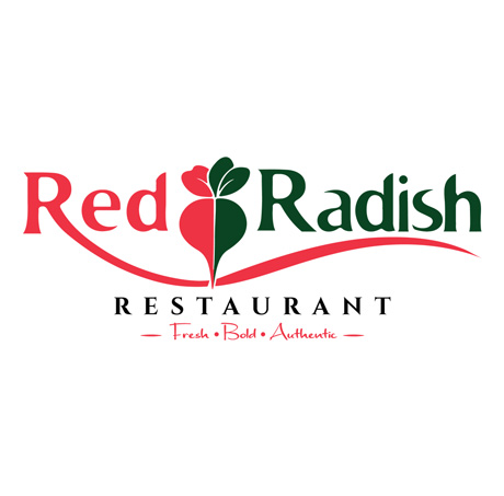
We simplified the radish into a clean graphic form and placed it between the words Red and Radish. This means the symbol isn’t sitting somewhere above or beside the name; it becomes part of the name itself.
That small decision helped bring the whole identity together.
The leaves at the top bring another natural element while keeping the connection to fresh food clear. It is one of those restaurant logo design ideas in which the business name and symbol support each other rather than working as separate elements.
Working With Red and Green
The color direction came instinctively from the name and concept.
Red became the main color for the first part of the name and one half of the radish. We then introduced a deep green for the second part of the name, leaves, and the other half of the symbol.
These colors have enough contrast to make the identity noticeable, but we deliberately avoided making them excessively bright. Red Radish is positioned as a high-end restaurant, so the colors still needed to feel controlled and mature.
For us, developing high-end restaurant logo designs in Kenya doesn’t necessarily mean using black, gold or complicated luxury symbols. A premium identity can still use strong colors. What matters is how those colors are balanced with the typography, spacing, and overall presentation.
Making the Radish Part of the Lettering
One of the strongest parts of the identity is the relationship between the radish and the typography.
The vegetable sits at the center of the logo, visually connecting the two words. Its red and green halves also create a natural transition between the two main brand colors.
Instead of adding several food illustrations, we allowed this single element to do most of the visual work.
This makes the logo relatively simple and makes the radish easier to recognize when used outside the full name. The symbol could eventually appear on a menu cover, napkin, takeaway package, or social media profile without the full logo next to it.
That flexibility is important when developing restaurant branding in Nairobi, because a restaurant identity rarely stays in one place.
Giving the Name Its Own Character
Typography played an equally important role.
We wanted the Word Red Radish to stand out and make a strong first impression every time a person views the brand logo.
A flowing red line underneath the name completes the composition.
It adds movement without introducing another separate graphic. It also helps hold the different elements together and gives the logo a wider shape that works particularly well on restaurant signage, menu headers, and other horizontal applications.
The result is a logo that feels polished yet retains some energy.
Fresh, Bold and Authentic
The tagline “Fresh • Bold • Authentic” was chosen to support the identity’s personality.
Instead of trying to explain the entire restaurant concept beneath the logo, these three words give a quick sense of the brand’s direction.
“Fresh” connects naturally with food and ingredients. “Bold” reflects the strong red-and-green identity, while “Authentic” gives the restaurant room to communicate its own approach to food and service.
The handwritten treatment of the tagline also creates a softer contrast with the main typography.
Thinking About the Restaurant Beyond the Logo
For restaurant businesses in Nairobi, the logo is usually only the beginning of the branding process.
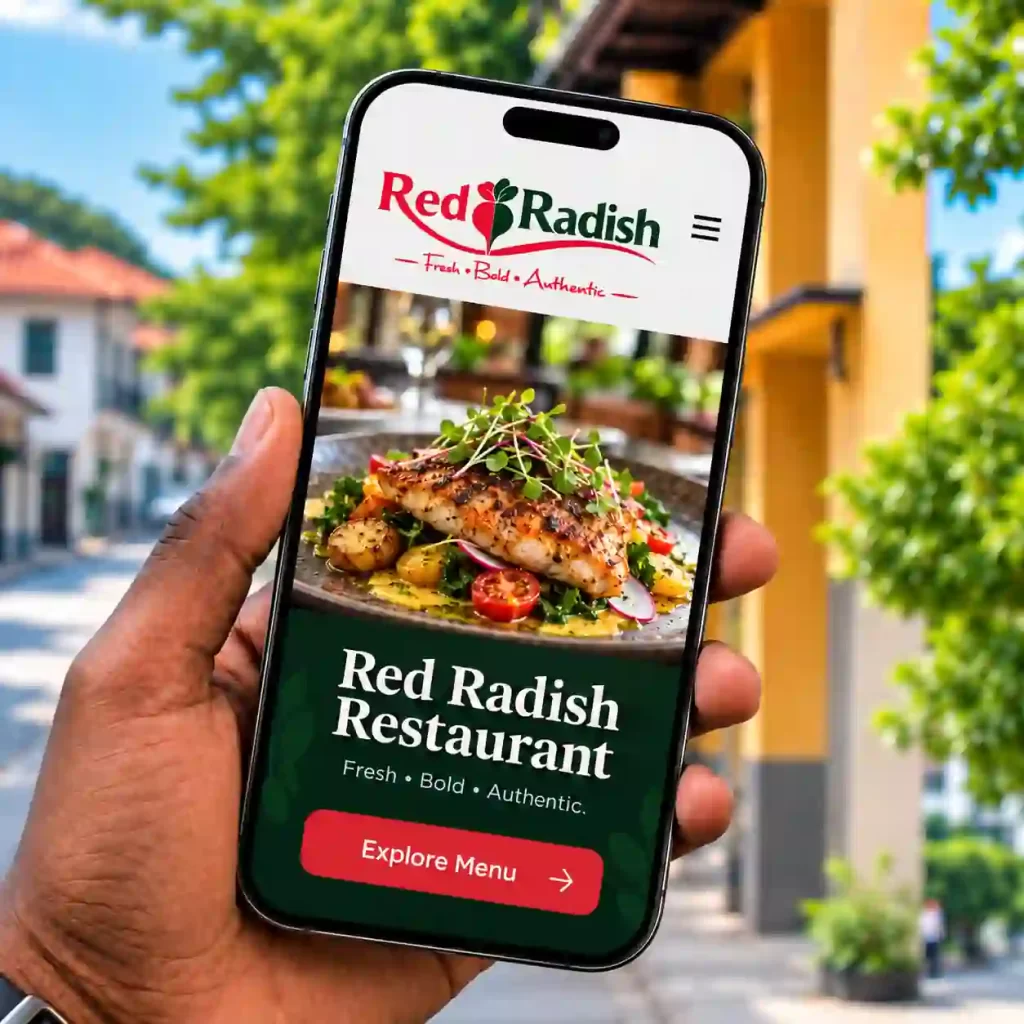
Target audiences always encounter the identity on outdoor signage before they walk in. Inside, they may see it on menus, staff uniforms, table items, or wall graphics. Someone ordering remotely might first encounter the restaurant through social media or takeaway packaging.
We considered these situations while developing Red Radish.
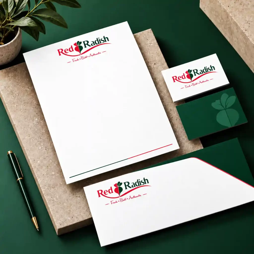
The main logo can work as the complete identity, while the radish symbol can be pulled out and used independently. The red and green palette can also continue across menus, promotional materials, food packaging and online content.
This creates consistency without requiring the full logo to appear on everything.
Designing for a High-End Restaurant Without Overdoing Anything
One of the interesting parts of this project was achieving the right balance.
A high-end restaurant identity doesn’t necessarily have to look complicated. Including more details, more colors, or more decorative elements doesn’t automatically make a brand feel premium.
With Red Radish, we preferred to work with a few recognizable elements and give them enough space to stand out.
This is something we consider when looking at the best restaurant logo designs in Nairobi, Kenya. The strongest identities are often the ones customers can recognize without having to study every detail.
Red Radish has the name, the vegetable symbol, two main colors, and a simple supporting tagline. Together, they provide enough material to build a wider restaurant identity without making the logo difficult to use.
Building an Identity Around Red Radish
The Red Radish project shows how the best restaurant logo designs in Nairobi, Kenya, can grow from a simple idea closely connected to the business name. By combining the radish symbol with carefully selected typography and colour, we developed one of our high-end restaurant logo designs in Kenya with enough flexibility to work through different applications. The project also gave us practical restaurant logo design ideas that can extend into menus, signage, packaging and digital marketing. This broader thinking is an important part of restaurant branding in Nairobi, particularly for businesses that want customers to experience the same recognizable identity wherever they interact with the brand.