

The Tropical Canopy Group Logo Design Story
Introduction
The Tropical Canopy Group is a group of companies that manages its subsidiaries. Typically, a group of companies sets the structure for the businesses it oversees and ensures they run smoothly and professionally.
The Tropical Canopy Group Limited was established to build a corporate identity that reflects the main logo and its purpose of managing other companies. Following our client’s comprehensive brief, we developed a visual identity that reflects the brand and defines the company’s objective.
The Inspiration Behind the Logo
The logo confidently conveys a sense of shield and protection through the umbrella symbols, strengthening the connection to the other company.
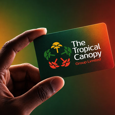
The logo combines Jungle Green, Golden Orange, and Red Orange to capture the logo’s purpose. The colors are vibrant, especially on a white background, making the logo stand out even more.
Beyond the logo, Tropical Canopy Group Limited represents a company and business focused on sustainability and growth. The logo is inspired by protective canopy tree symbols, which represent leadership and nurturing responsibility. The color palette of Green, Gold, and Warm Orange represents trust and prosperity in modern business.
The Design Elements Making the Design
Palm Tree
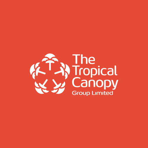
Every time you see a tree, you see growth. The Palm tree is positioned at the top as the leading main company, symbolizing steady development.
Six Curved Shapes Surrounding
We have a segmented shape on the logo to create an emblem that represents unity and connections.
Color Palette
Pantone 130 C (Golden Yellow) – representing success and opportunity.
Pantone 3435 C (Jungle Green) – symbolizes trust and sustainability.
Pantone 7417 C (Warm Red Orange) – represents ambition.
The Design Process
Label Gurus’ design team was tasked with crafting this logo, and we developed a visual identity that conveys leadership. Through this design project, we ensured every aspect of the design worked together.
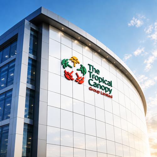
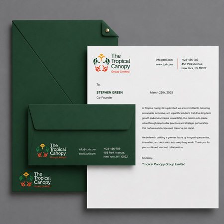
The element used has a symbolic meaning. We also developed a mock-up to demonstrate the concept, helping the client visualize the brand clearly.
The Design Challenge
The main challenge with the logo was balancing the symbol with the typography since the name was slightly long.