

How the label is designed
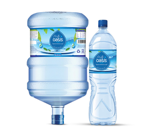
The main focus of the Water label is at the center, where the brand logo appears inside a large blue circle or oval. Around it, layered blue water-wave graphics make it look like the logo is coming out of clean, flowing water.
Behind and around the logo, there is a light sky-blue and white background with water splashes, droplets, ripples, and bubbles. The white parts give the design some space to breathe, while the darker blues near the bottom and around the logo add contrast.
At the top of the water label design , green leaves and other natural elements suggest a freshwater source or nature. This helps the design feel less artificial or too corporate.
The bottom part of the label features several curved blue waves instead of straight blocks. These overlapping waves add a sense of movement and help show the idea of flowing water.
For the 5-liter container, the wider label has enough space for all the required regulatory and technical details. The logo stays in the center, while information like nutrition facts, barcode, recycling symbols, and manufacturer details are placed on the sides. This way, the technical details do not distract from the branding. The bottle follows the same visual identity but is simplified because there is less label space. This is a good example of creating a consistent water packaging system across different bottle sizes, Reach to Label Gurus designs and we shall guide you all the steps to make your brand stand out.