Packaged Drinking Water Label Design in Kenya: The Shindo Water Story
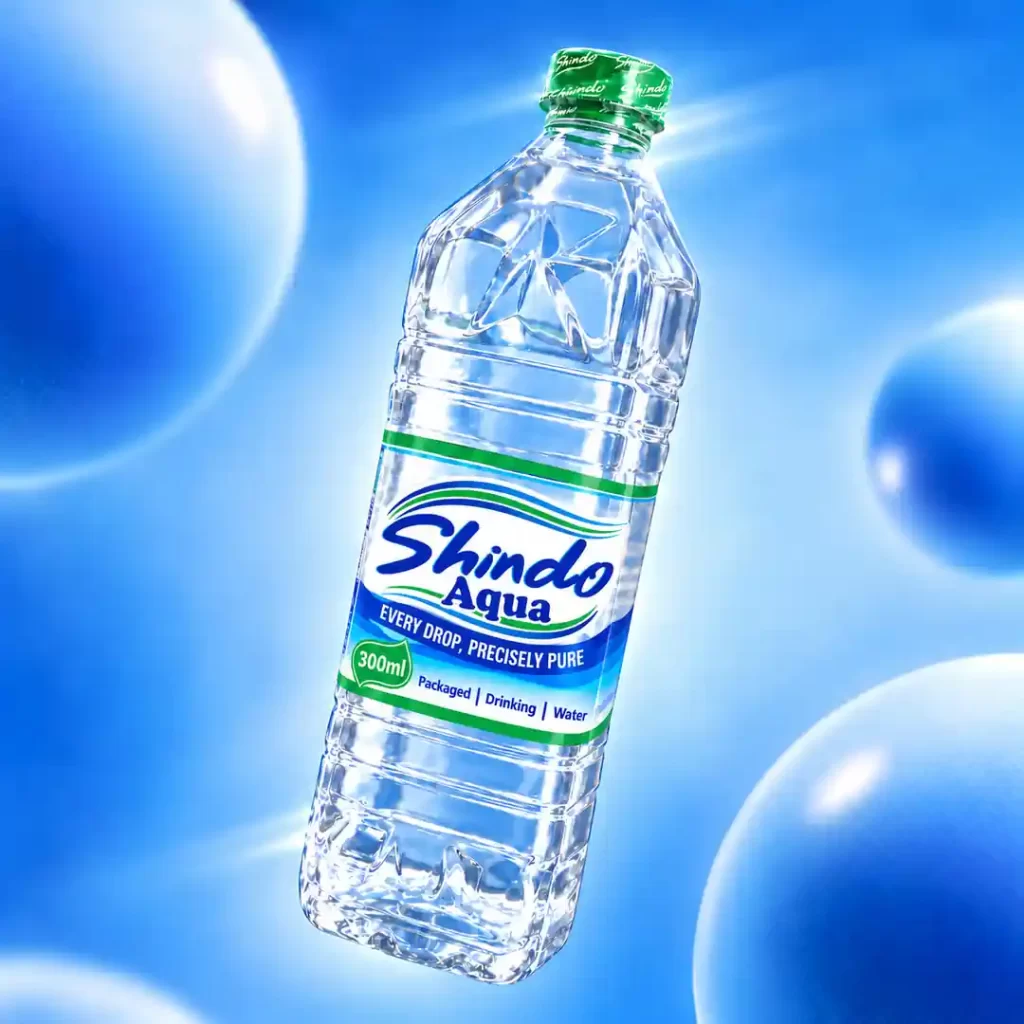
Shindo Water came to us with a clear idea: they wanted a bottle that would look different from what they were used to seeing on the market. This packaged drinking water label design in Kenya started with a brand from the Coast, around Mombasa, and a brief that went beyond choosing colours. The client had already chosen a four-sided bottle and wanted much of the label to remain transparent. Here is how we designed the Shindo Water label around those requests, while giving the brand a look of its own.
The client knew what they wanted.
Some clients come with only a brand name. For Shindo, the client explained the direction they wanted us to take. They did not want us to repeat a design they had already seen on another water bottle. They wanted something people could recognise as Shindo.
Three things guided the work: the bottle shape, the colours and the clear areas of the label. We had to bring them together without allowing one to spoil the other. A good label on a flat screen was only part of the job. It also needed to make sense on the bottle the client had chosen.
Working with a four-sided bottle
The bottle was one of the first things that made this project interesting. The client had chosen a four-sided shape instead of the usual round bottle they often saw.
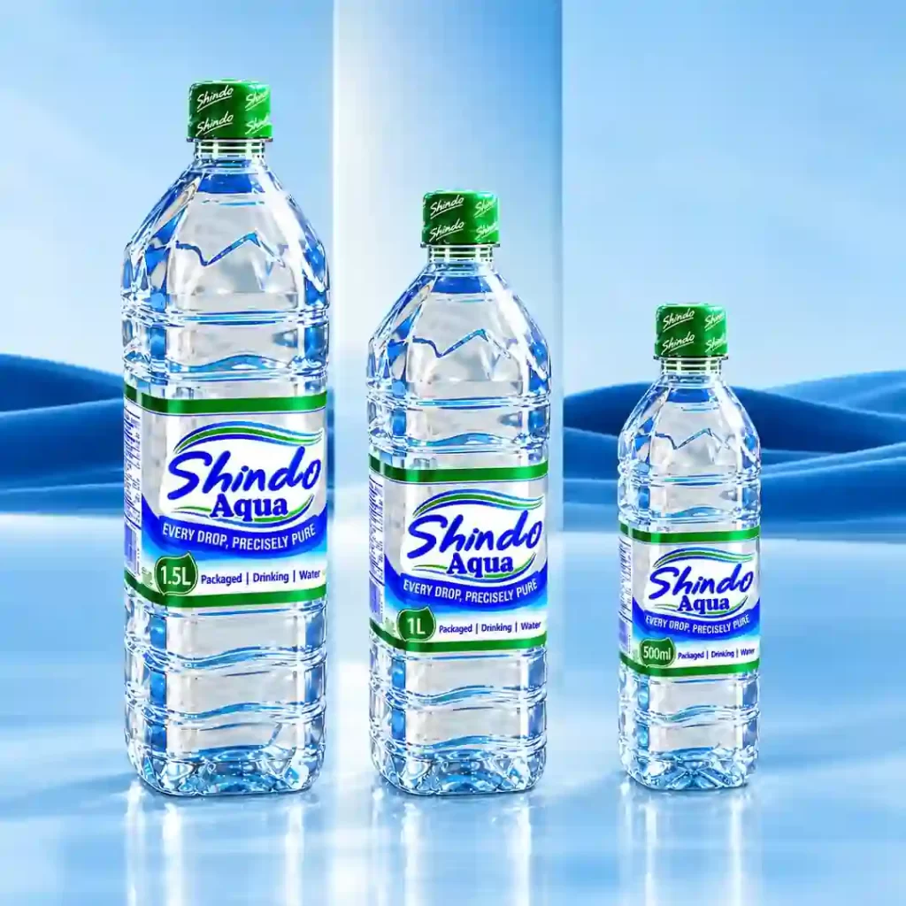
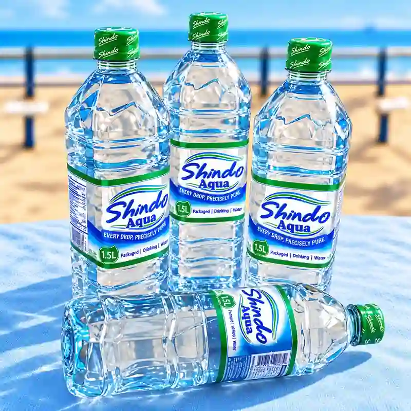
For this four-sided water bottle label design, we considered how the artwork would sit across the front and continue towards the sides. The Shindo name needed enough room to be seen clearly. We also wanted the bottle’s shape to remain noticeable once the label was on.
There was no need to hide that choice under too much artwork. The bottle itself was already contributing to the product’s appearance.
Using sky blue, dark blue and green
The client requested sky blue, dark blue and green. Blue is familiar in water packaging, so the difference here came from how we used the three colours together.
Dark blue gave the Shindo name a strong presence. Sky blue brought a lighter colour into the artwork, while green appeared in the surrounding details and bands. We wanted the colours to belong together without turning the whole label into a solid background.
That balance mattered because the client wanted customers to see the water through the packaging. Filling every space with colour would have taken us away from the original brief.
A transparent water bottle label design in Kenya
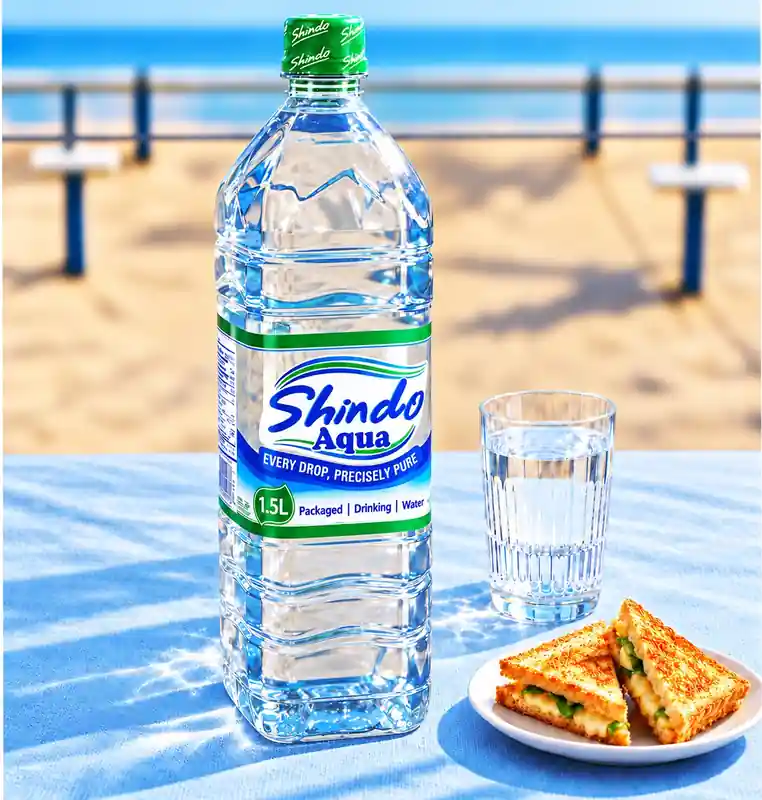
The clearest instruction was to leave most of the label transparent. The client’s target was around 80% clear space, allowing the product inside to remain visible.
They were looking for a different approach from labels with a full blue background covering the bottle. For this transparent water bottle label design in Kenya, the clear areas were part of the design from the beginning. We planned the coloured elements around that request, rather than treating every empty area as a place to add more graphics.
Custom bottled water packaging design for coastal brands
Shindo’s coastal background belongs in this story because it is where the client’s brand originated. But the direction of the artwork came from their particular brief: a four-sided bottle, three chosen colours and a largely clear label.
Final thoughts
For us, this packaged drinking water label design in Kenya was about making the client’s idea work. Shindo Water features a distinctive bottle shape, sky blue, dark blue and green, and clear areas that keep the water visible. If you are looking for packaged drinking water label designs in Nairobi, Kenya, this project gives you a look at how we approach a brief: understand the bottle, listen to the client, and build the label around the product.